Trick and Treat was a 2D side scrolling arcade style game made in Unity 2D. The game was a project that spanned the course of five weeks. It was worked on eight total people in our Game Design and Development class. With such an abundance of people in the group, we were able to specialize a lot more in this project.
I took on the role of user interface (UI) designer and programmer for this project. It was my job to make all the buttons and menus for the game state, pause state, and menu states. This role in this project really ended up sparking my interest in the user experience design.
With the early idea of the game following a sort of arcade style theme, I was faced with the early choice of a button system or classic cursor system for the user menu selections. The ultimate decision was to use a button interface for the interactions on the menu. Unity had a GUI system that was fairly user friendly when it came to the placement of textures, buttons, and text. This allowed for one script to handle each scene UI.


We ended up finding a font online called Groovy Ghosties and immediately fell in love with it. The first two images on the right are the final texture we used for the button background, and an example of the text in Groovy Ghosties (converted to a PNG and placed in code over the templates). The second two were older versions of the button. All made using Adobe Illustrator and Photoshop.
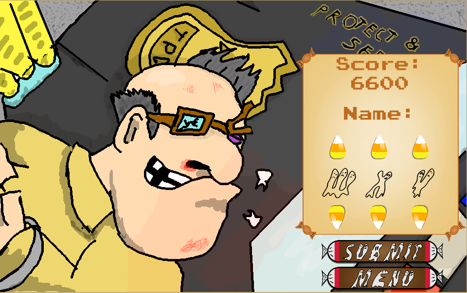
In addition to designing and creating the buttons, I scripted the button behaviors and menu interactions. This included the games score menu that uses Unity's player prefs tools to save a score and places it accordingly in the high score list.
For the gameplay UI, we wanted something that allowed for the background art to be appreciated in full. I initially had a lot more cluttered UI in plan during the first stages of designing it. We collectively decided that for the sake of a challenge to the player, we weren't going to provide the capture count or the number of active watchman. We also decided to stick with a life system as opposed to health. These decisions all radically changed the original design. Now we just had three life icons (using Tom's face) that show how many chances you have left. These icons even respond accordingly to Tom damaged state. I then decided to keep the score in the bottom center, where it doesn't intrude game play but still allows the user to see their score with ease.
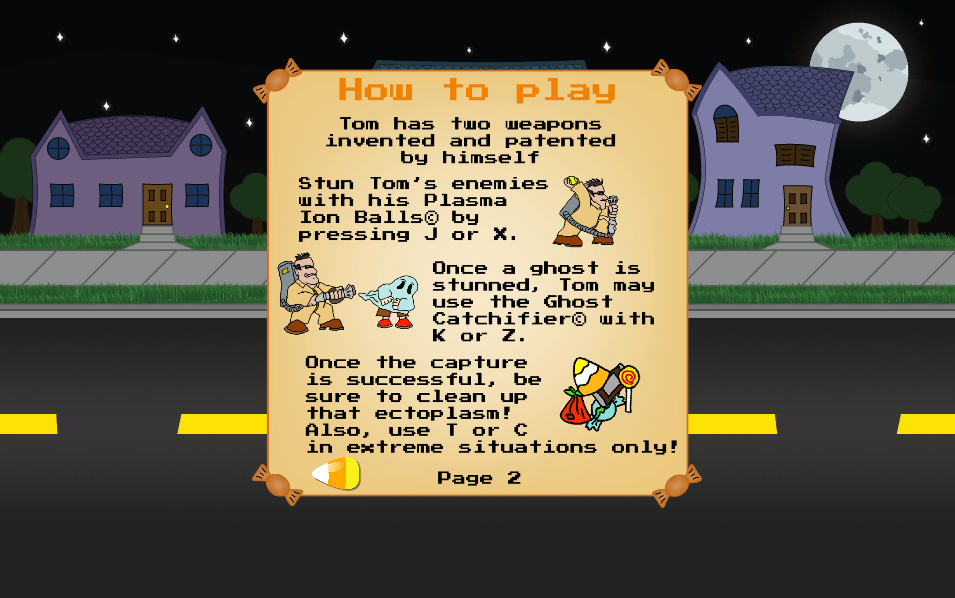
Recently, after playtesting the digital build several times among peers, we learned that a lack of guide was a problem. So I quickly got together a How to Play menu which consisted of two pages. These pages used a humorous narrative written by me to explain the controls to the player. We wanted the player to feel the true ridiculousness of Tom, our main character.
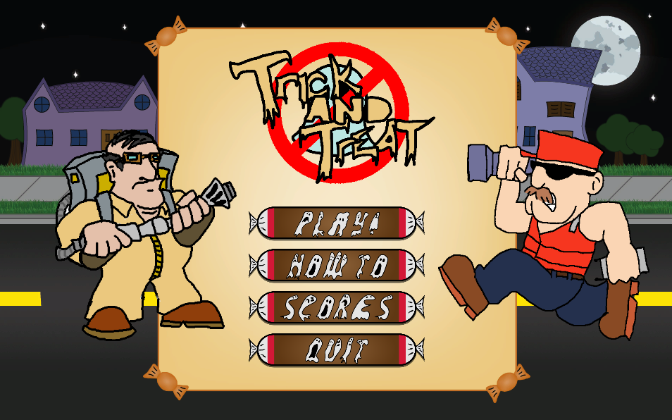
Below are snapshots of all UI elements designed by me and below that is a video of gameplay.


Unity Web Player | Trick and Treat


